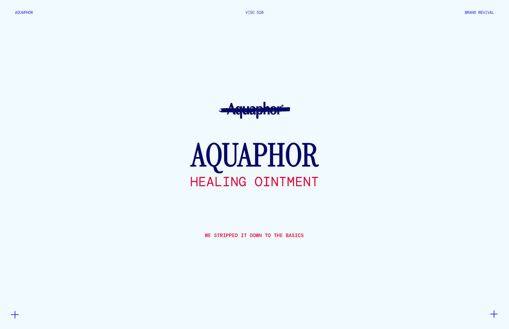
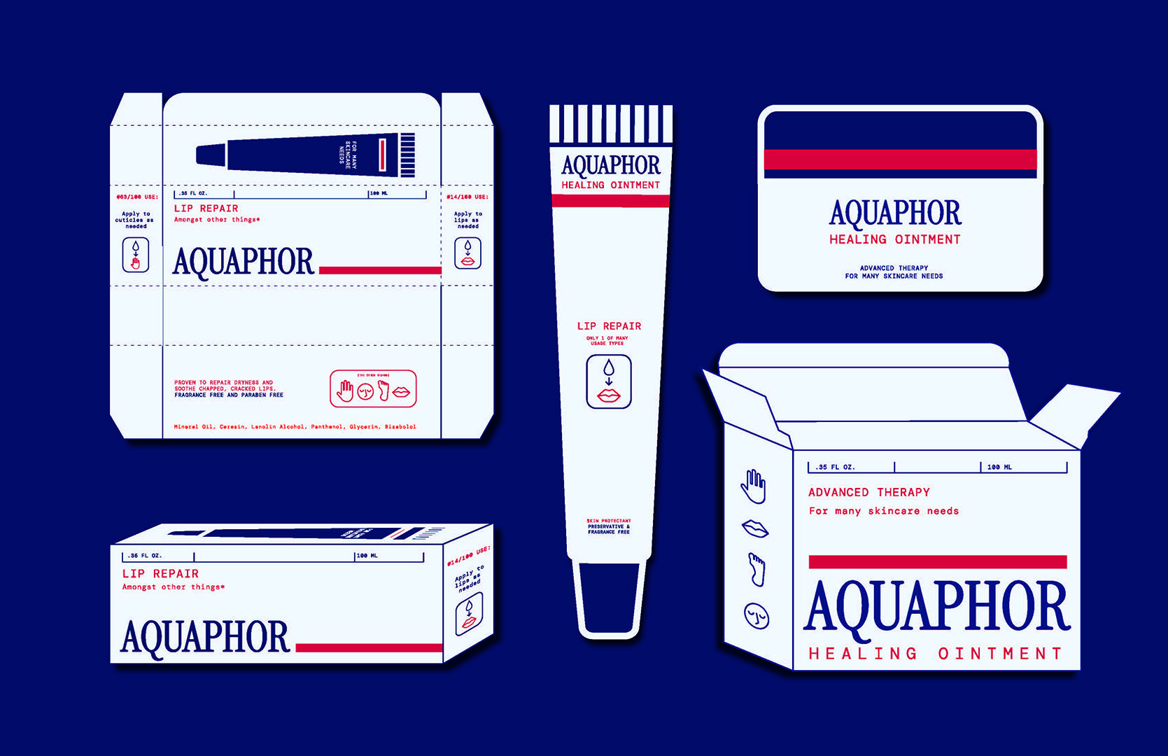
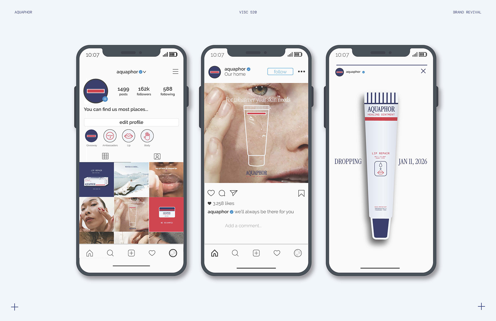
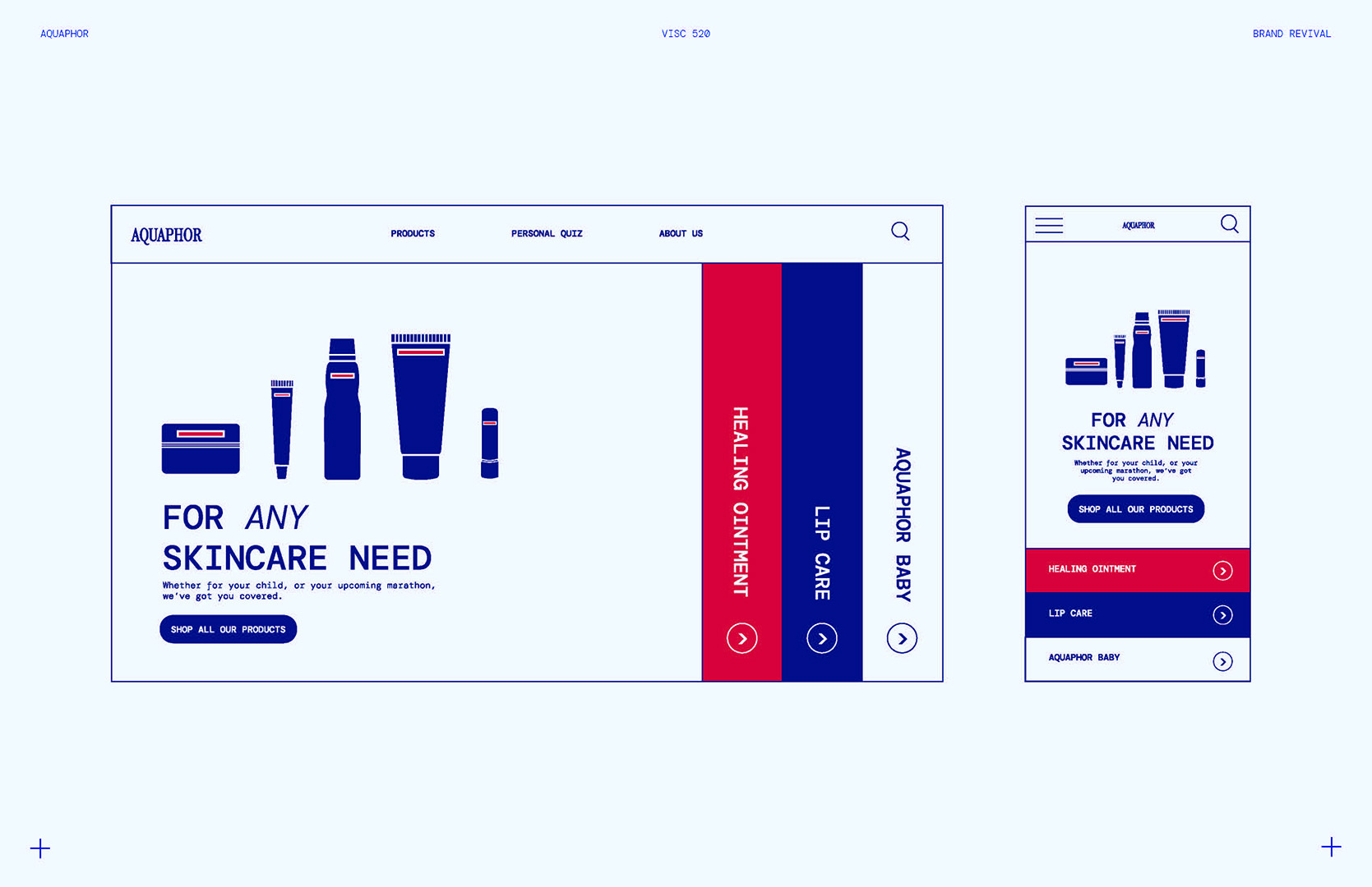
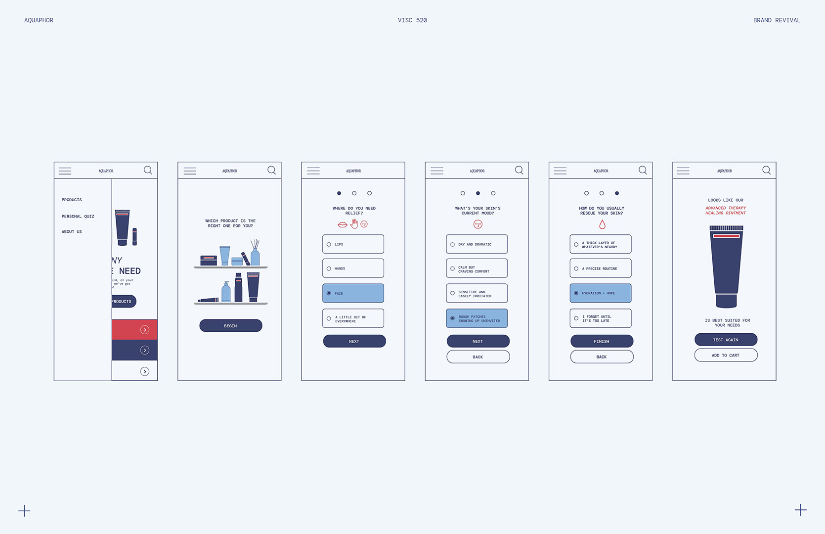
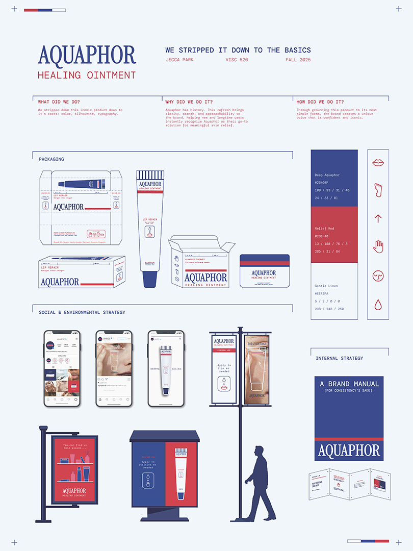
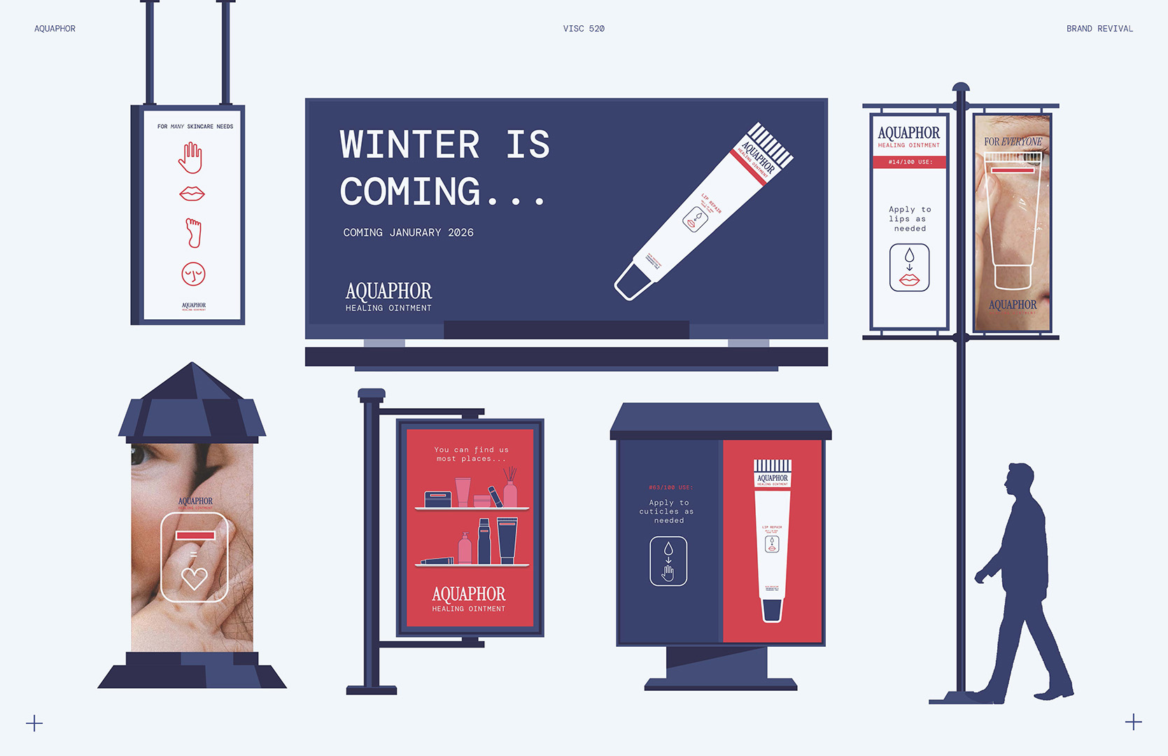
When rebranding an iconic brand like Aquaphor, research was at the forefront of designing. This project reimagines Aquaphor through an in-depth study of its medical history and deep-rooted associations with healing and care. By analyzing its original medicinal packaging, contemporary skincare trends, and consumer touchpoints, the rebrand balances clinical credibility with warmth and accessibility. The resulting system introduces a refined visual language—drawing from vintage medical packaging and modern typographic restraint—to position Aquaphor as both a trusted staple and a timeless essential for everyday care
Branding / Strategy / Packaging